
SMRT TIMES
Project Type:
Typography / Visual Narrative
Art Direction:
Sohee Kwon
In this project we will explore the power of typography and make 6 different typeface along side with four spreads of news paper based on a well known character. The project focuses not only on aesthetics but also needs to make sure the outcomes tell the story about the persona.
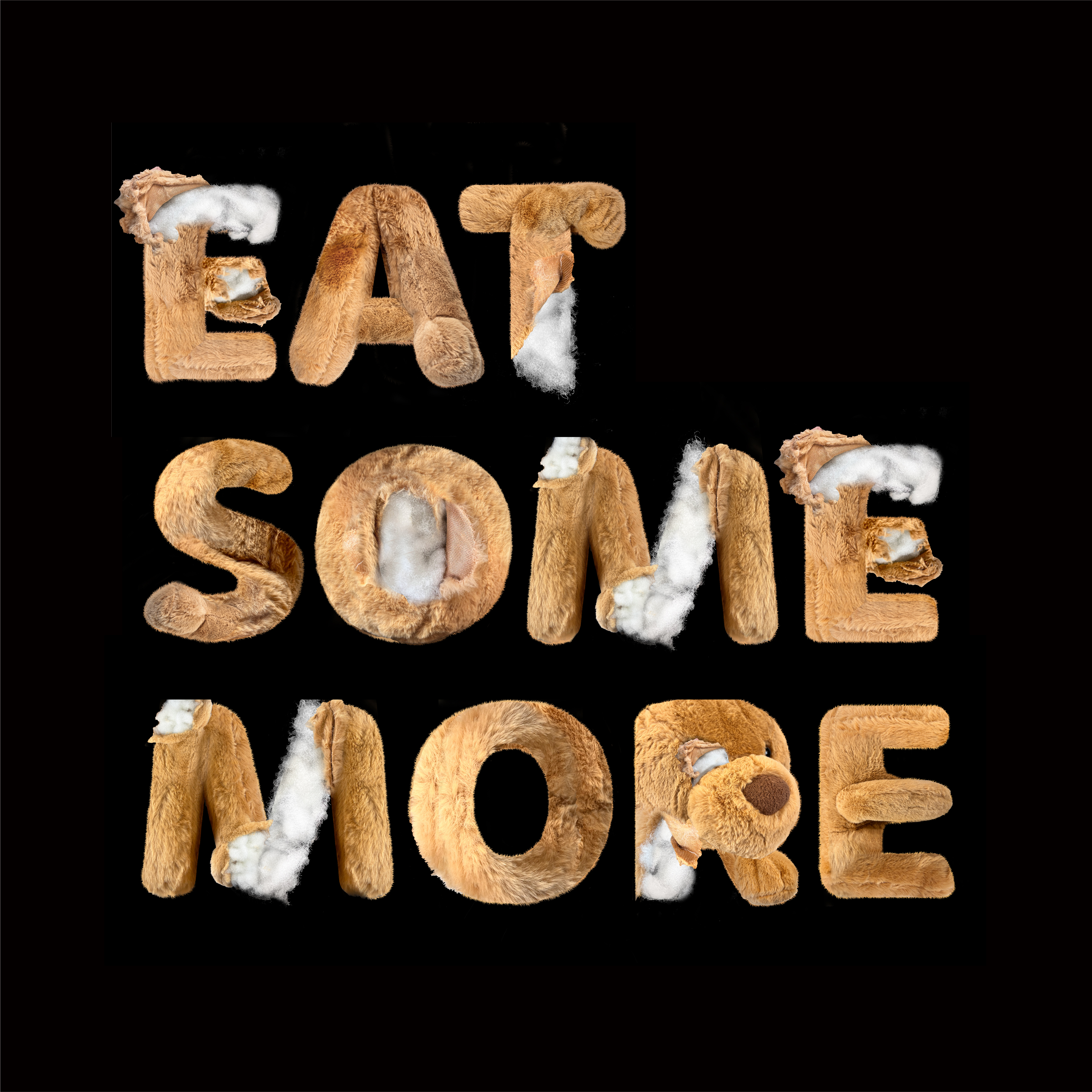
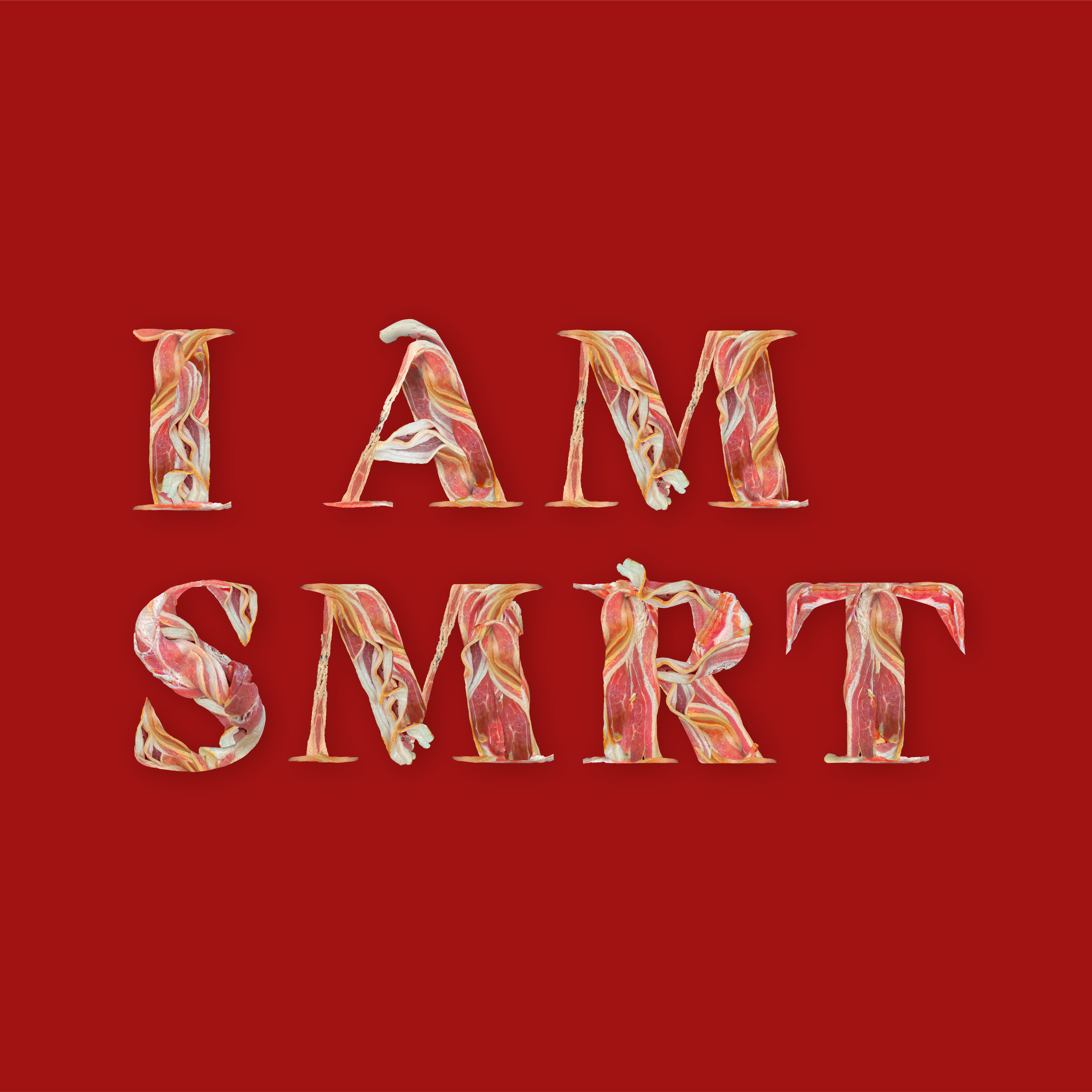
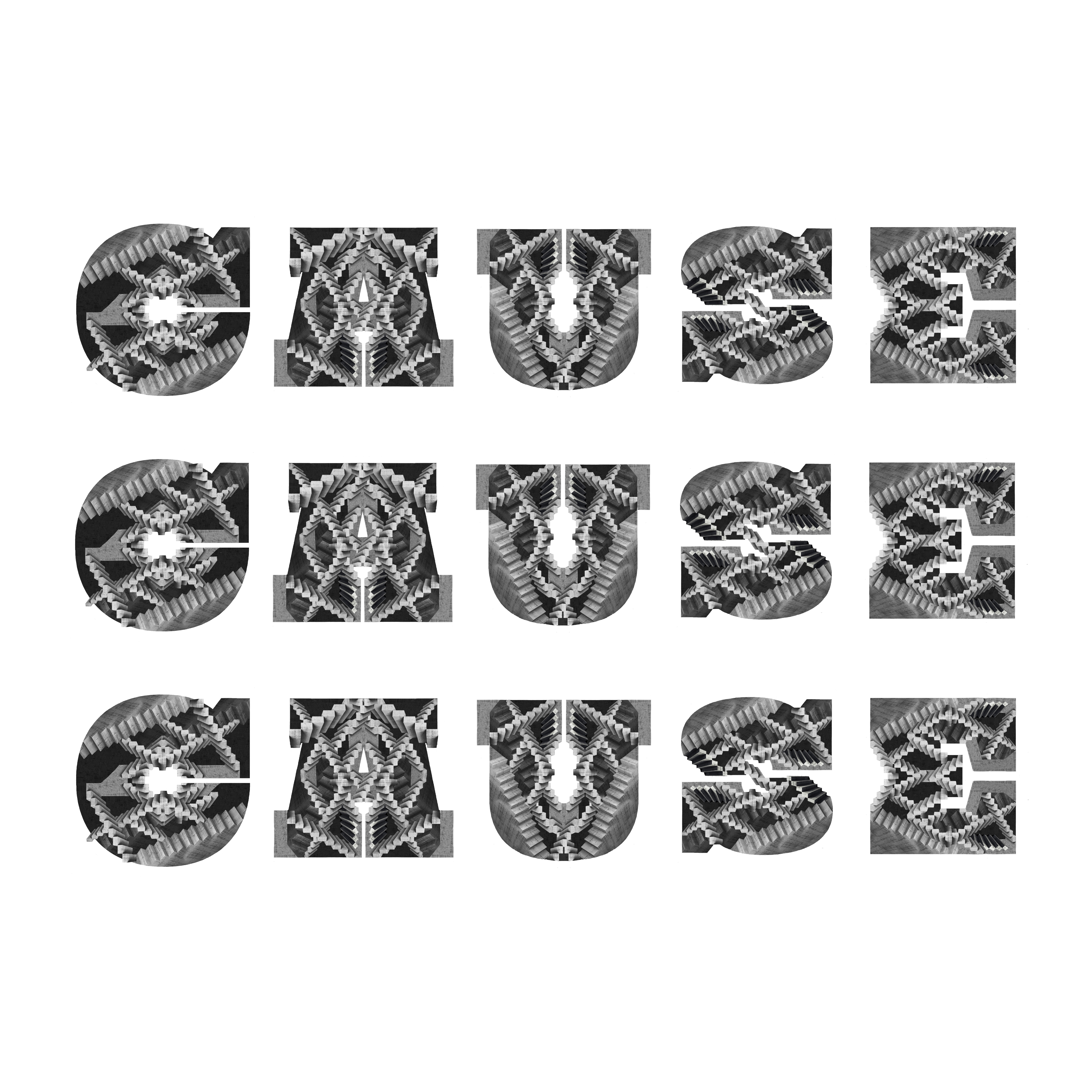
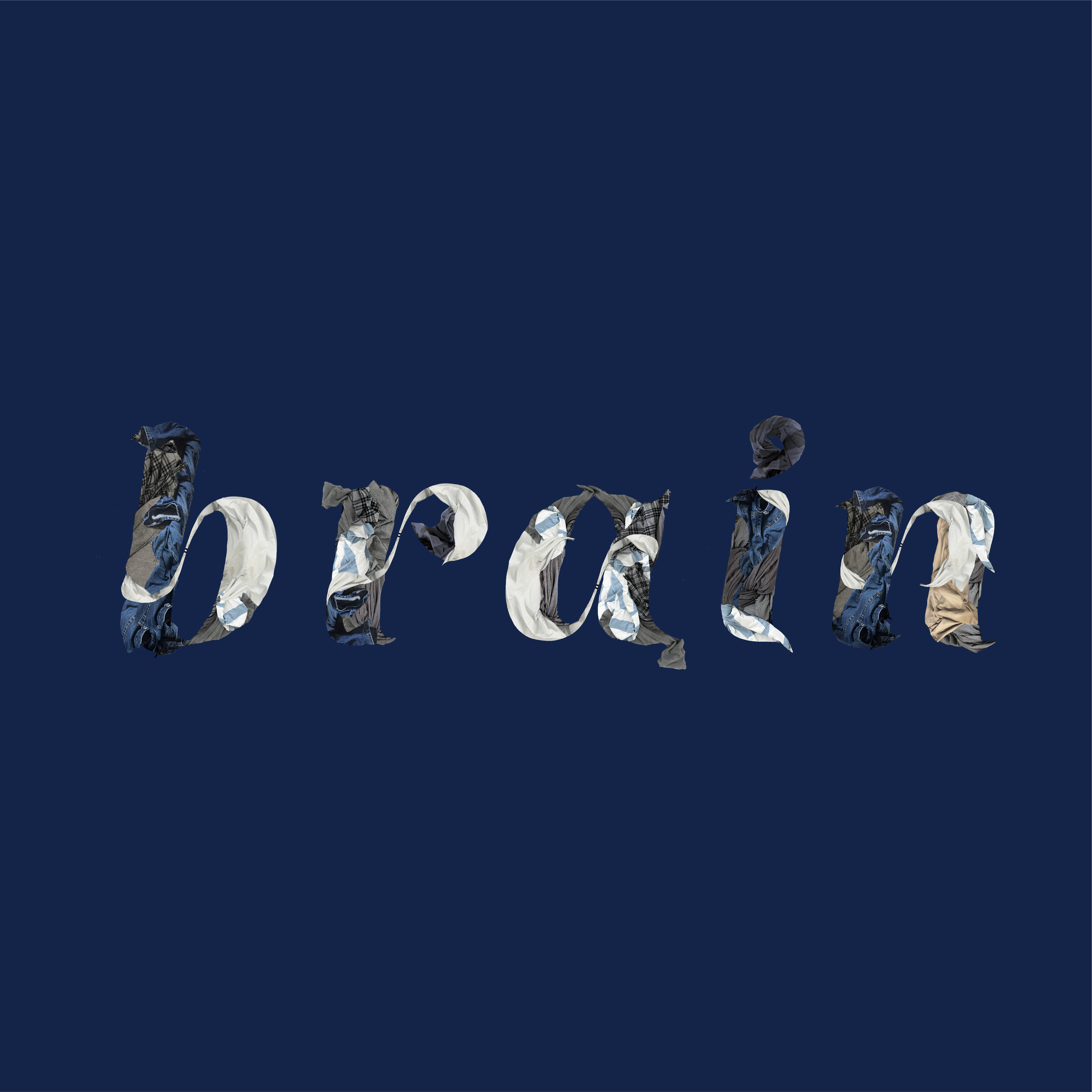
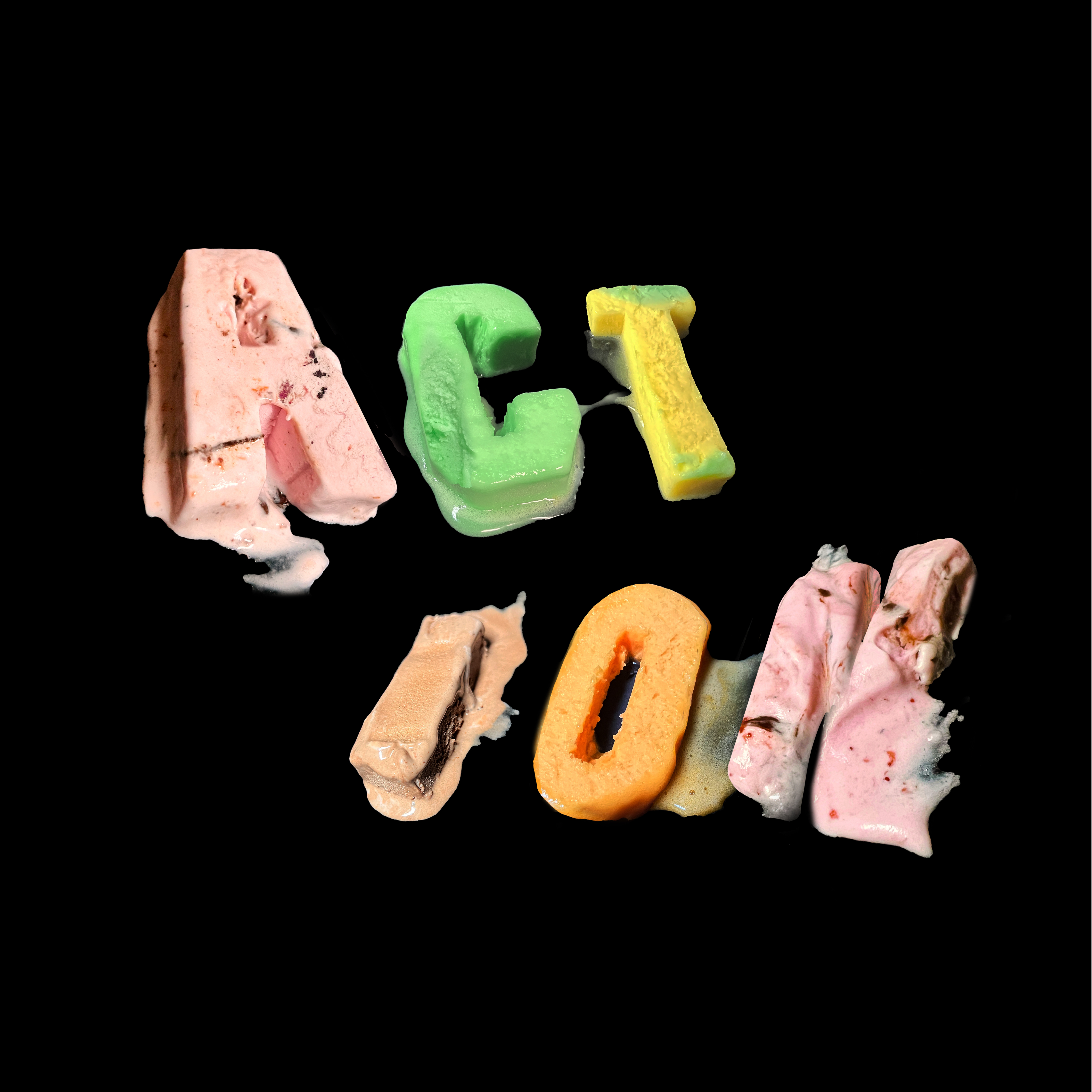
TYPEFACE DESIGN
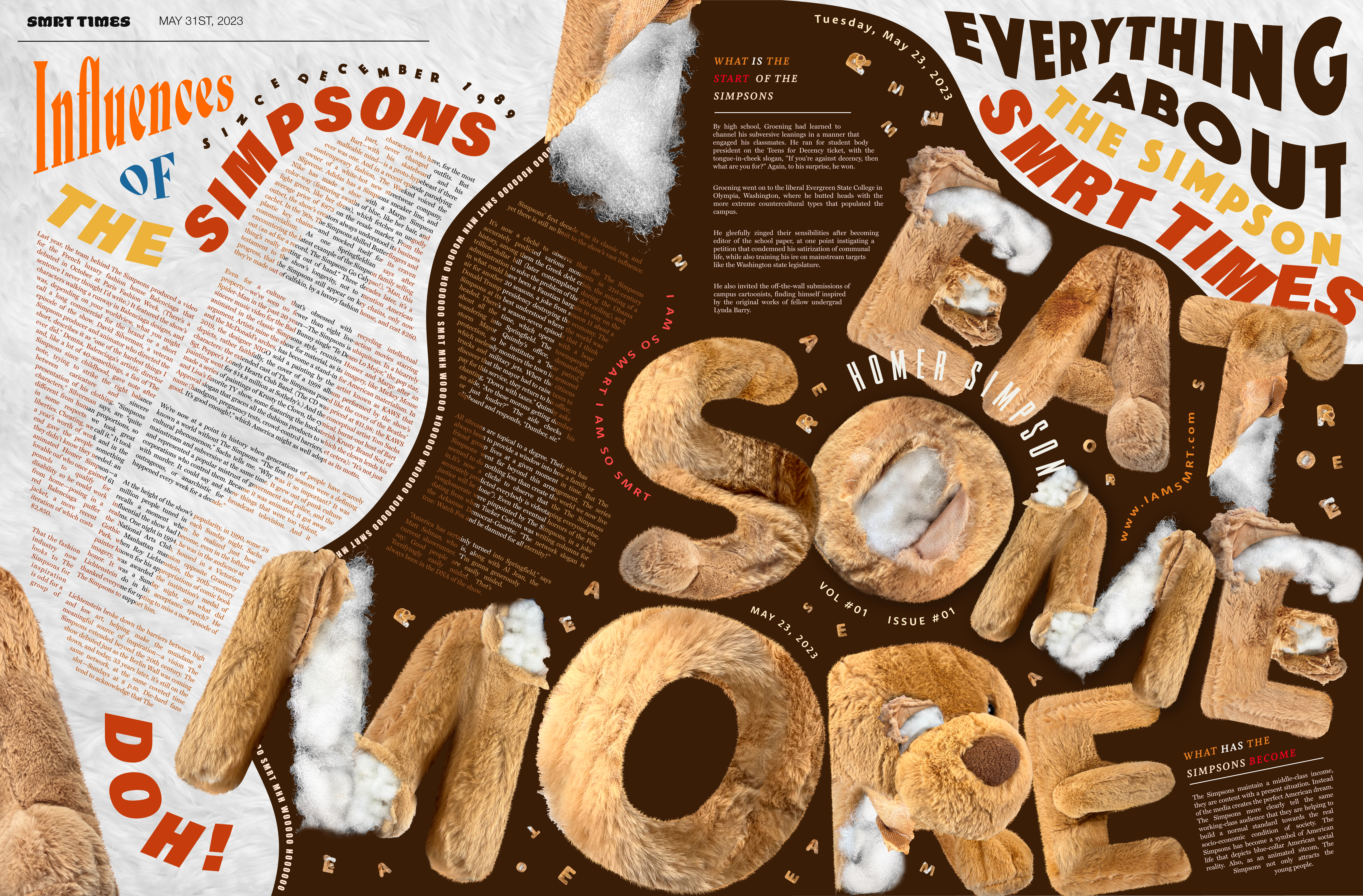
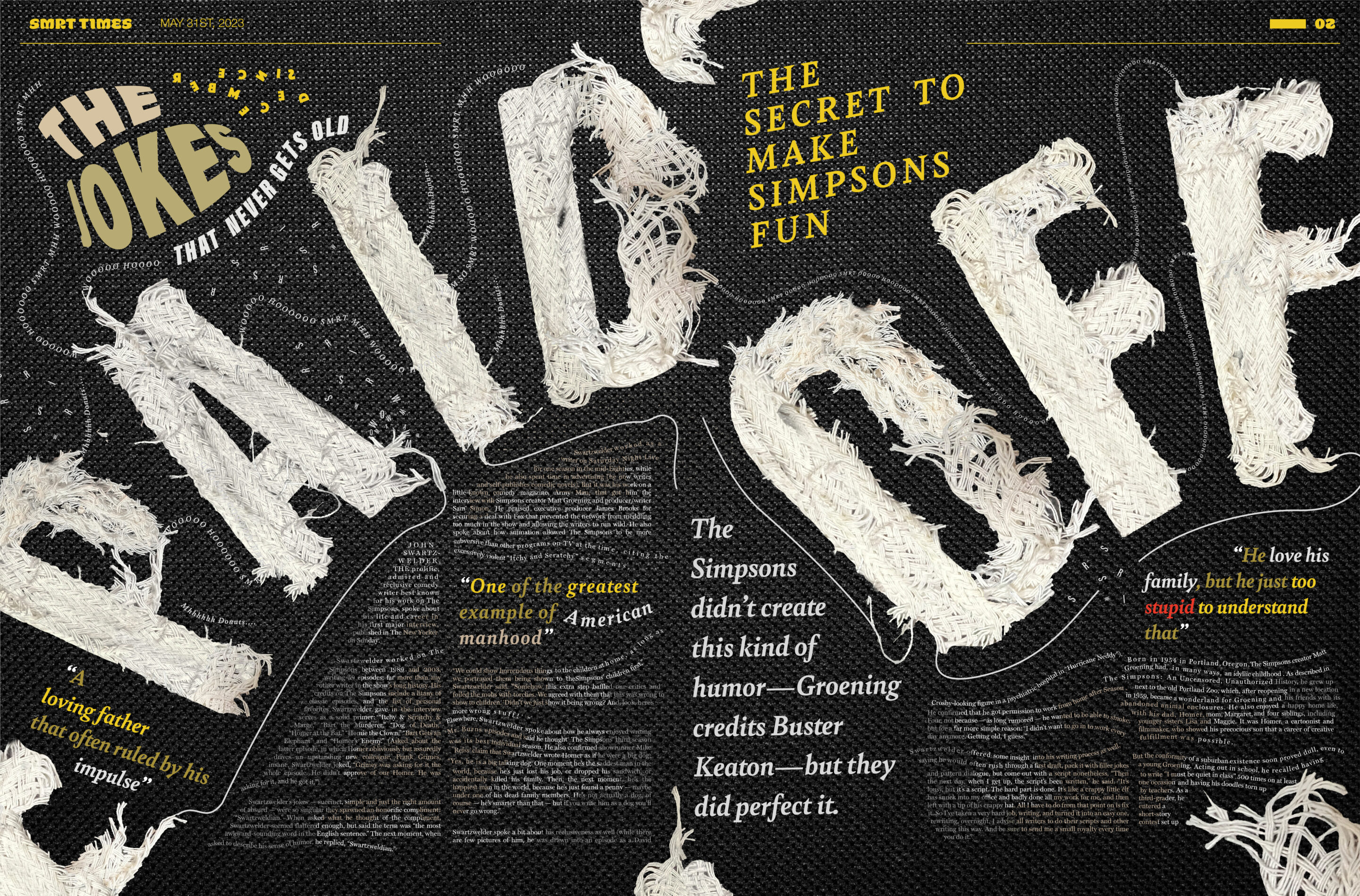
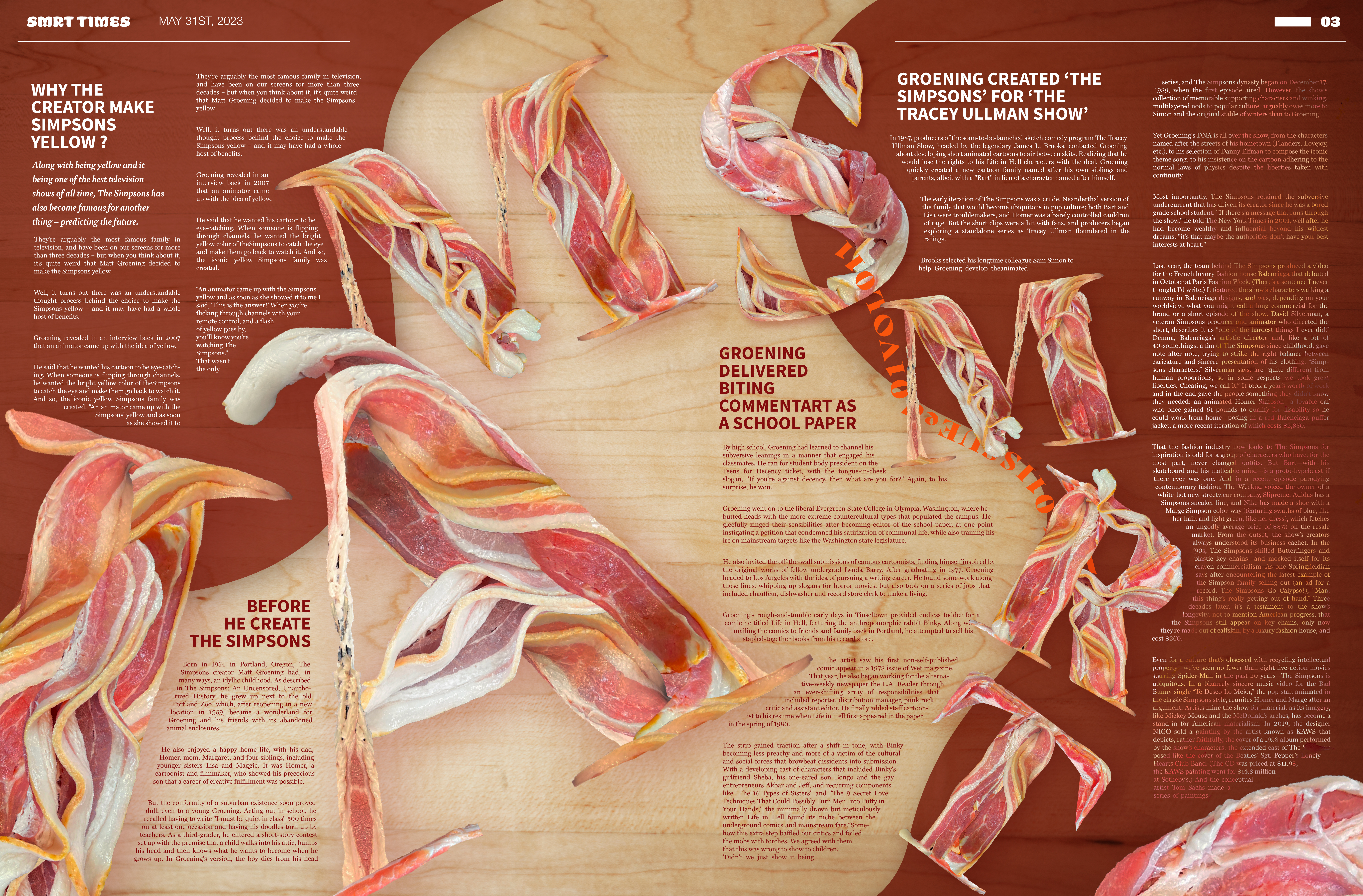
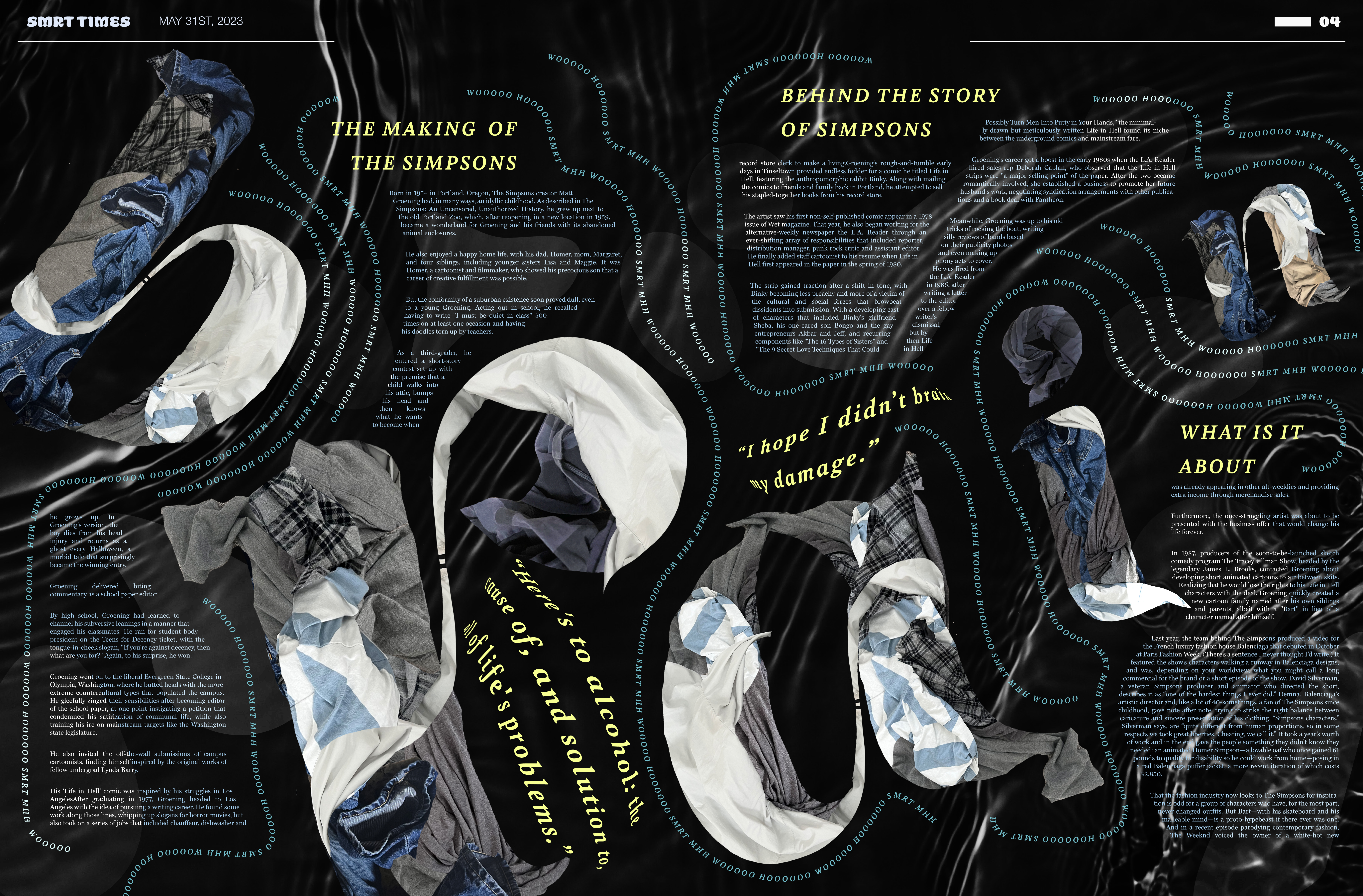
The character that I choose is Homer Simpson. As a famous father figure in the show: The Simpsons, Homer has a very strong personality and interesting behavior, I collect some of his famous quotes and start to explore how I can visualize Homer’s personality through design.
PROCESS
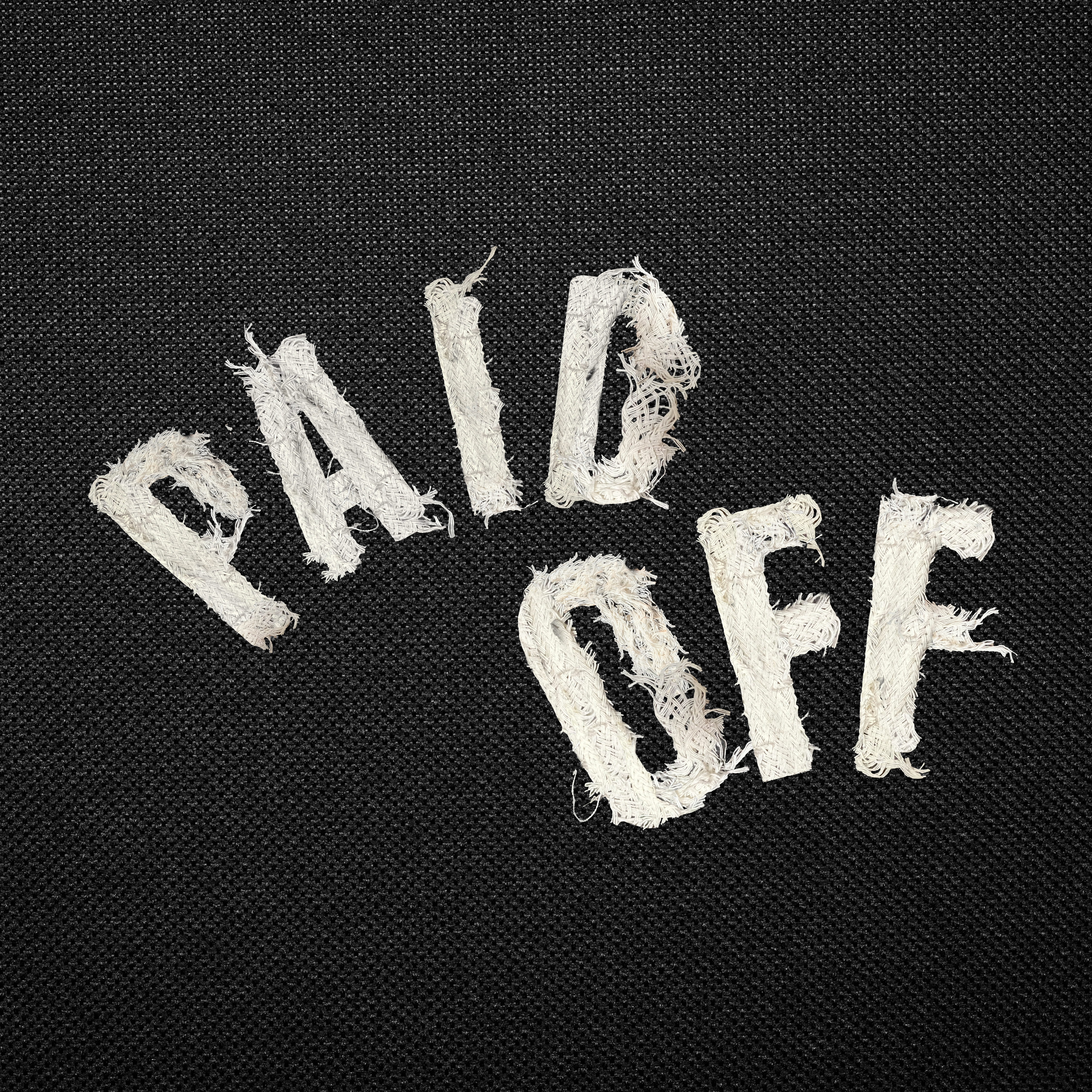
This projetct really pushed my limit. I thought I’m not good in Photoshop and I have never designed a newspaper before. But now I see how trying things outside of my comfort zone makes me grow so much. And all the hard work paid off in the end and I’m satisfied with the result I have.